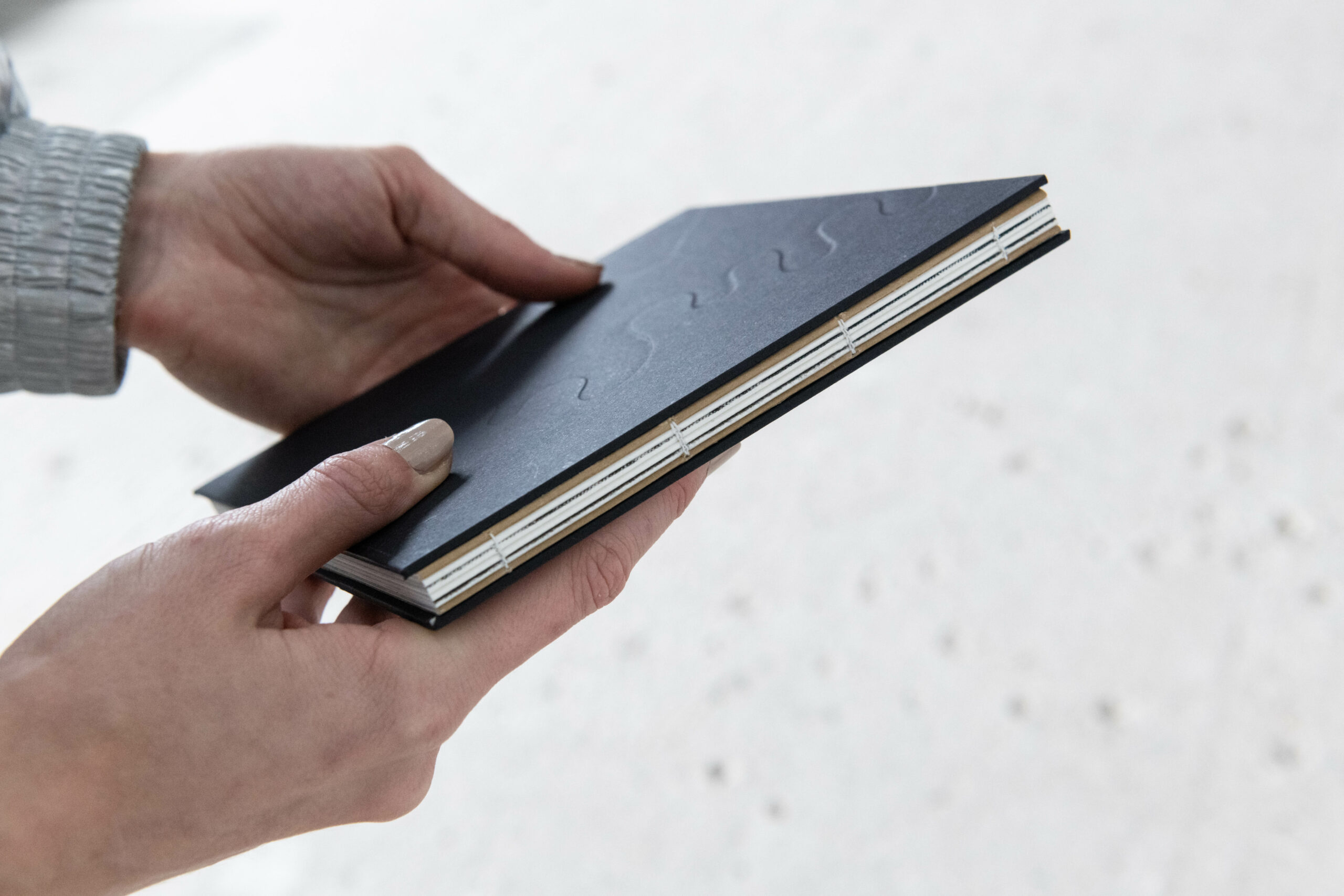
This bookbinding was beautifully done with the help of graphic Designer Samuel Götschin. Its Coptic binding reveals an open back and allows the book to lie flat when open. A relief technique was used for the book cover, which encloses a laser-cut shape inside the cover to highlight it. With dimensions of 16x16cm, the book can be easily carried anywhere and also fits well in one hand.
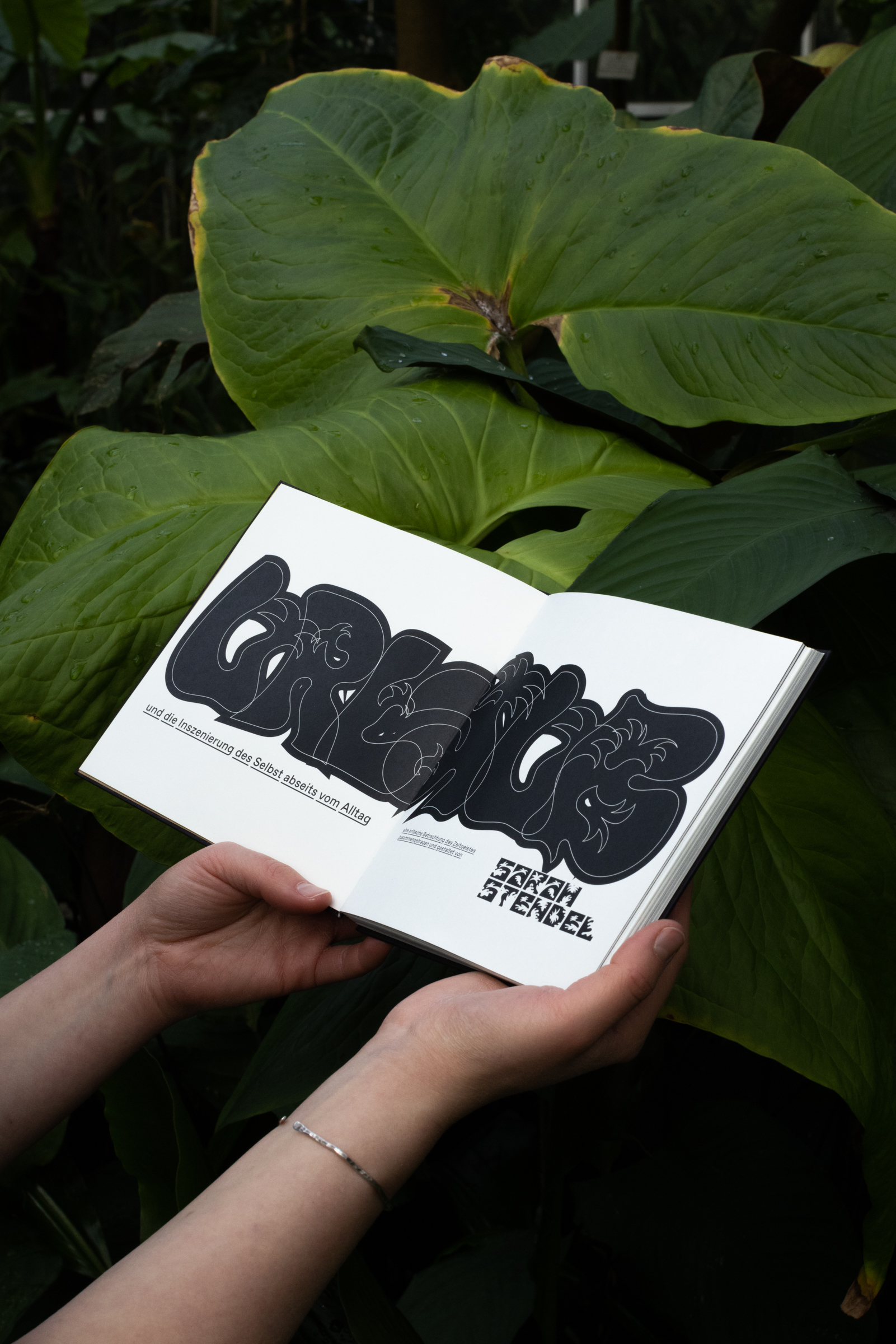
Book Design and Text: Sarah Stendel
Typeface: Favorit & Favorit Lining by Dinamo
Experimental Typeface: Holiday & Vacation by Sarah Stendel
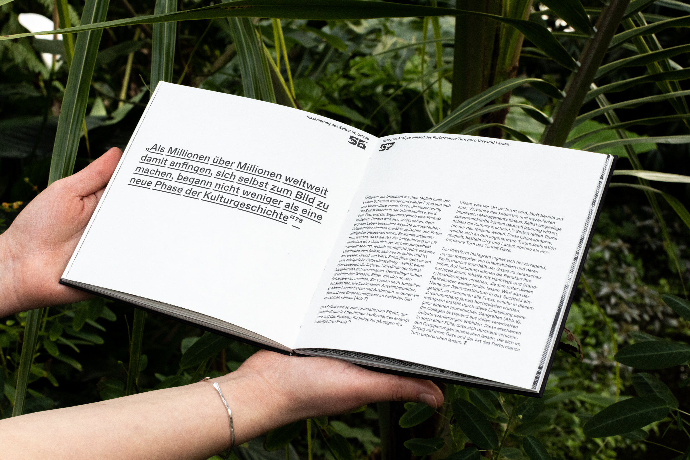
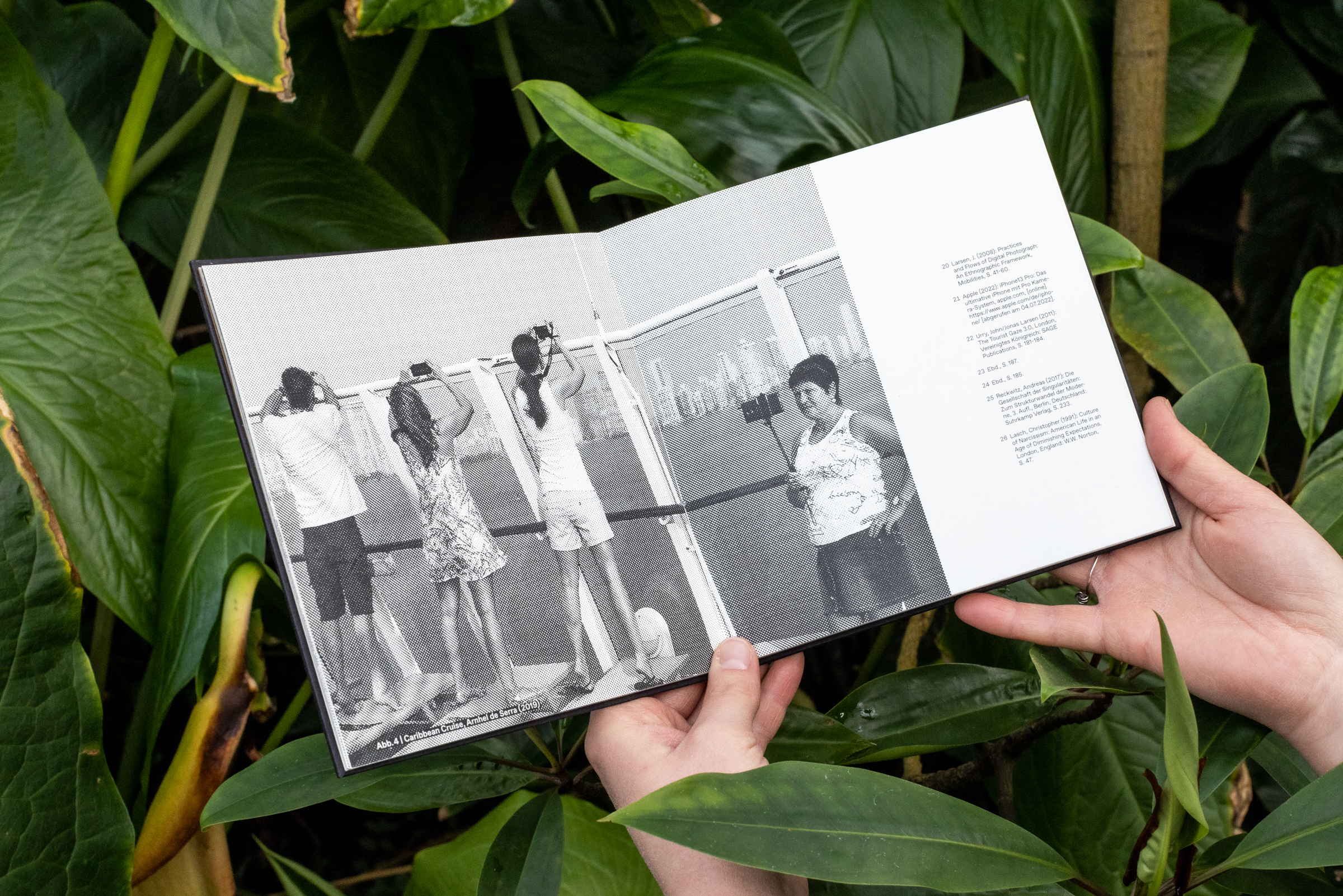
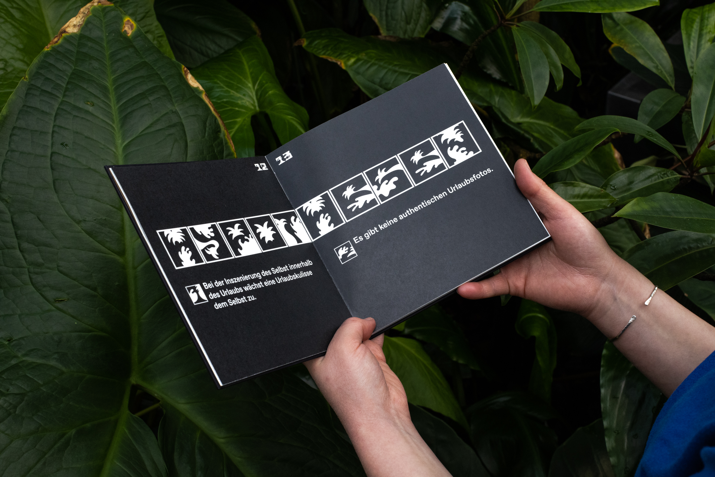
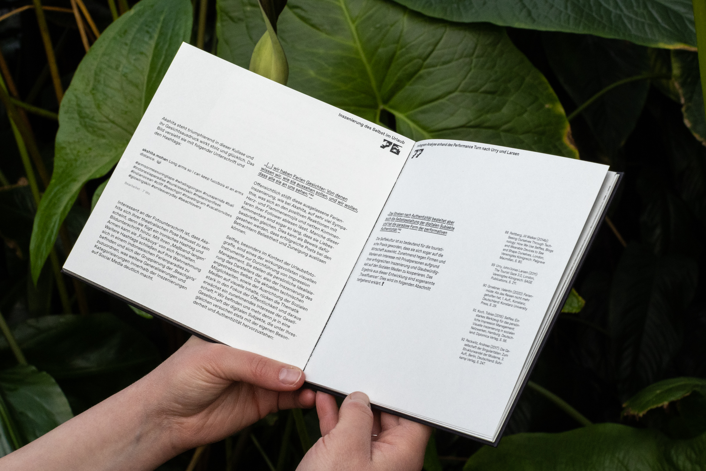
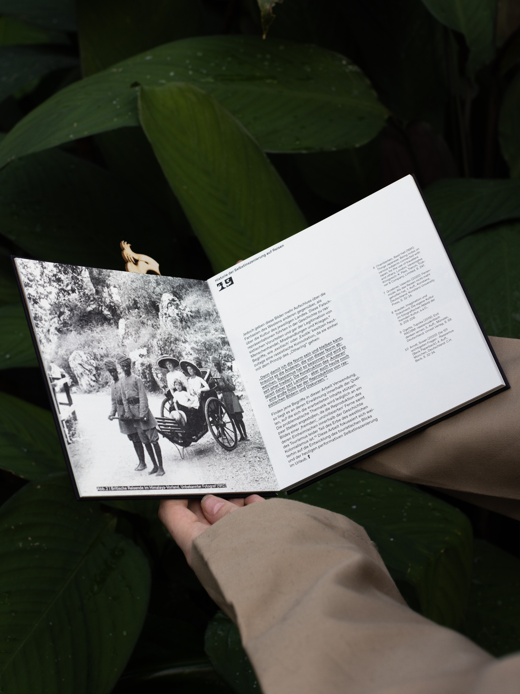
This book is dedicated to the photographic staging of the self while being on vacation in a foreign country. In the process, both shifts and continuities between early travel photography and contemporary selfie culture become apparent. The "purposeless journey" is an invention of the 19th century. It no longer serves a scientific mission, but solely the formation of the self. The photographing of one's own person against the backdrop of well-known cultural objects, whose consumption is ostentatiously displayed, takes its place alongside the staging of the self against picturesque backdrops. The latter in particular stands for the expression of an indefinite longing for extraordinary freedom in the distance - a distance that, in order to become the backdrop of a corresponding experience, must be largely emptied of its own history and politics. The colonial appropriation of the Other, who is merely destined to provide the background for one's own as the Other, is one of the problematic constants in the visual culture of Western tourism.
Supervision: Dr. Juliane Rebentisch