PROJECT
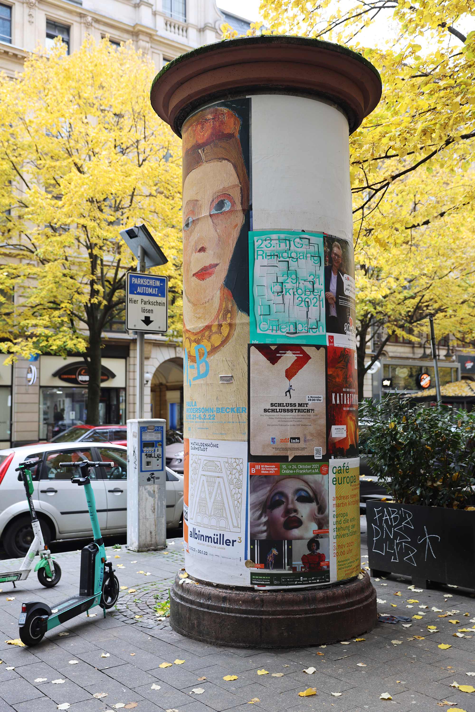
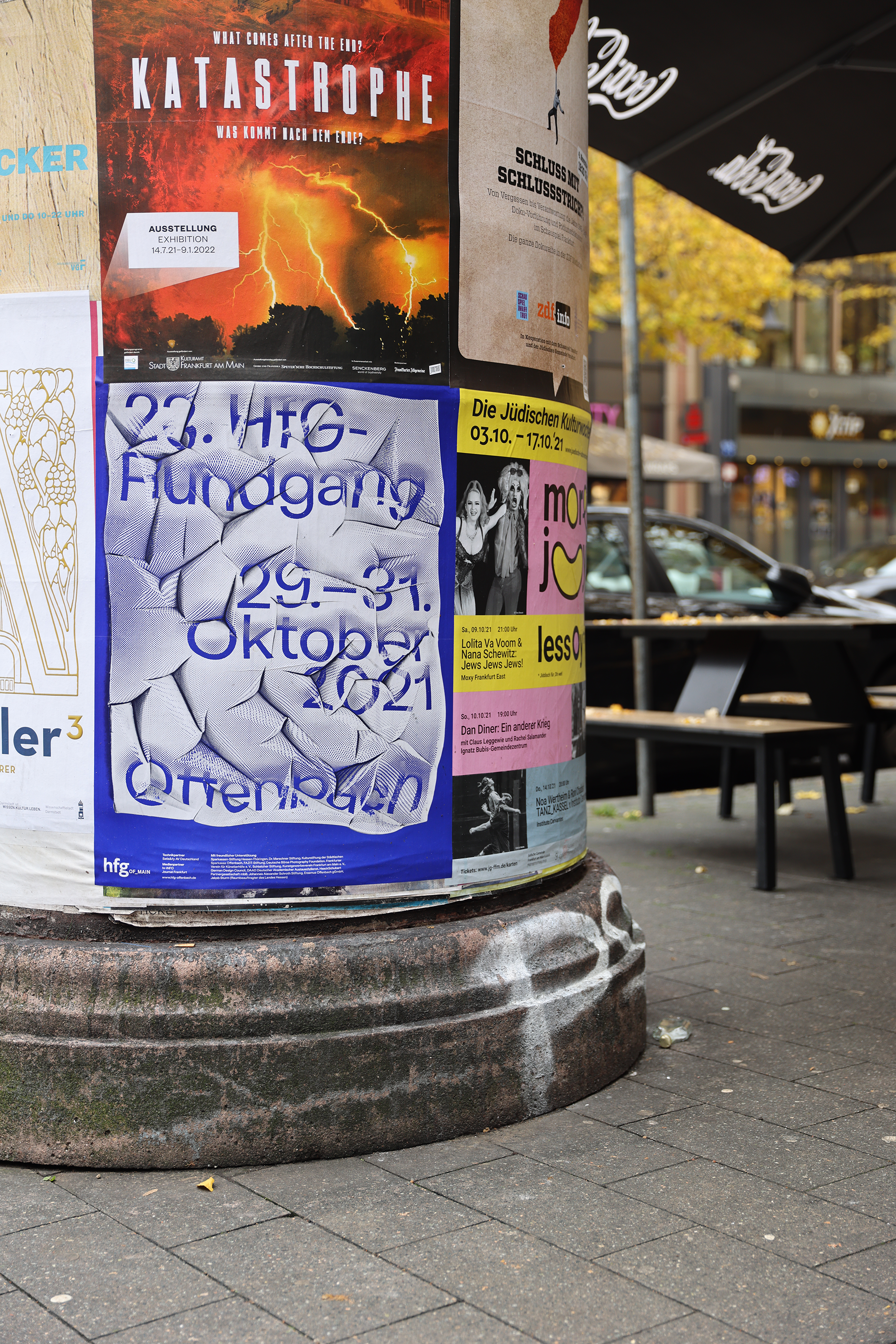
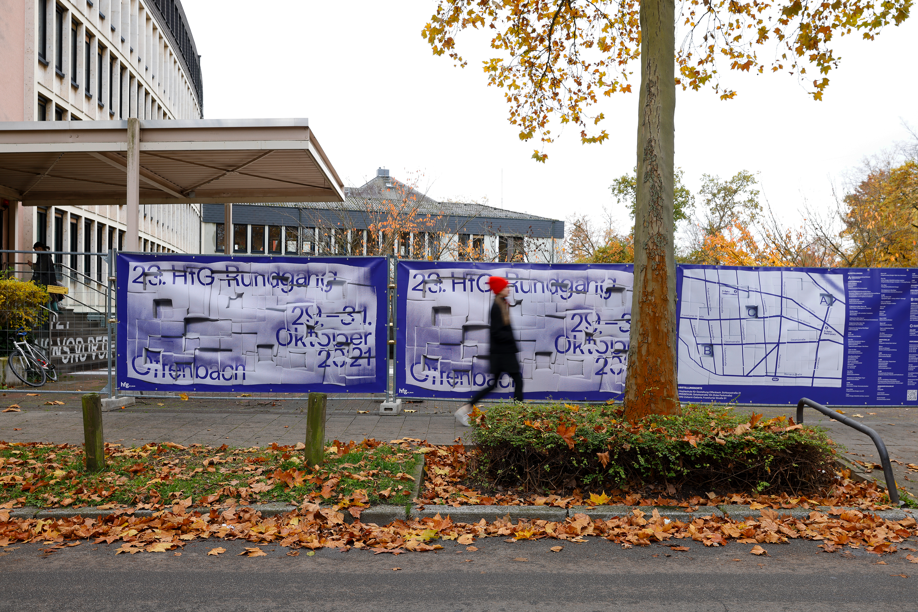
"Hands On!" 23. HfG-Rundgang
ROLE
Art Direction / Graphic Design
SCOPE
Visual Identity / Event Branding / Merchandise
COLLABORATOR
Laura Hilbert
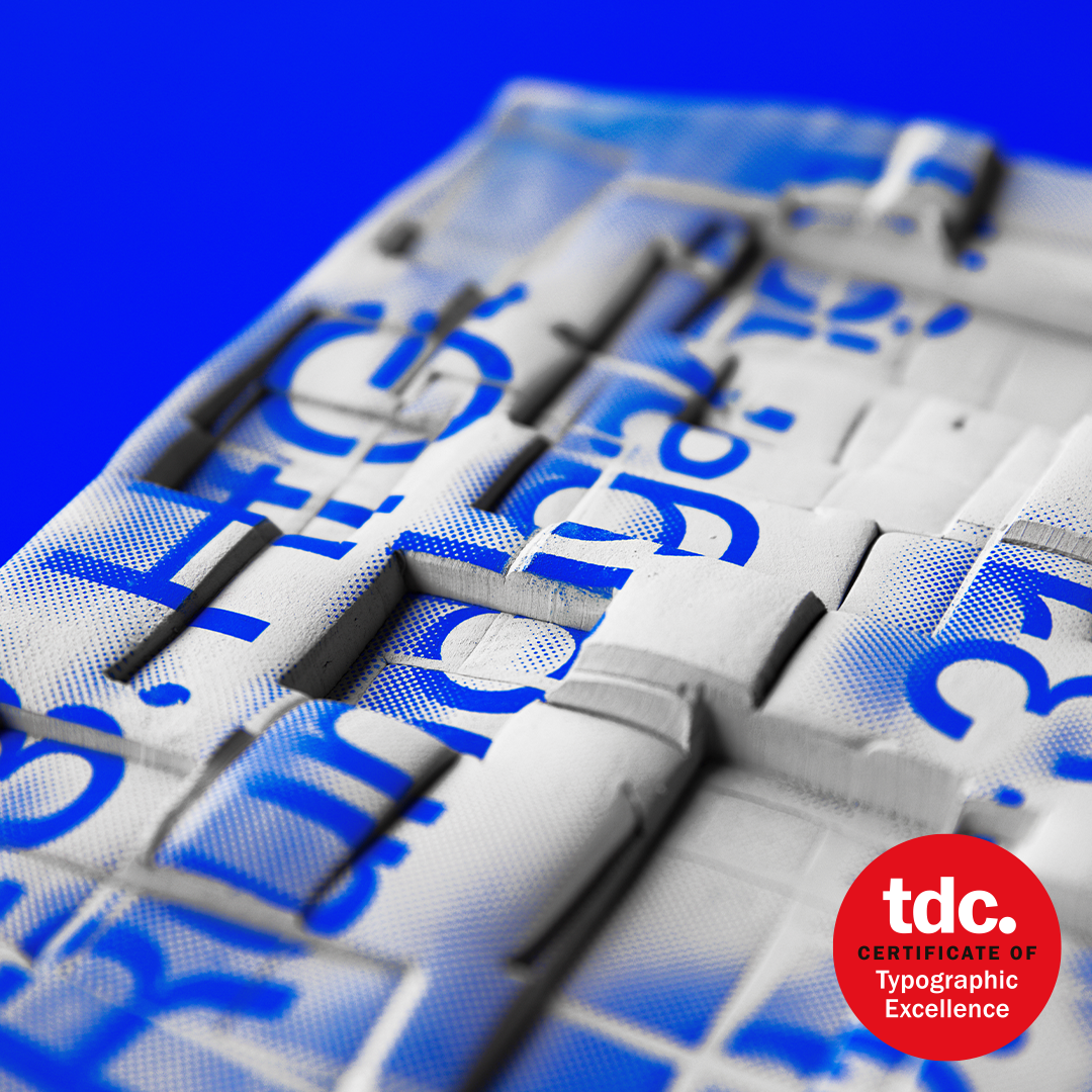
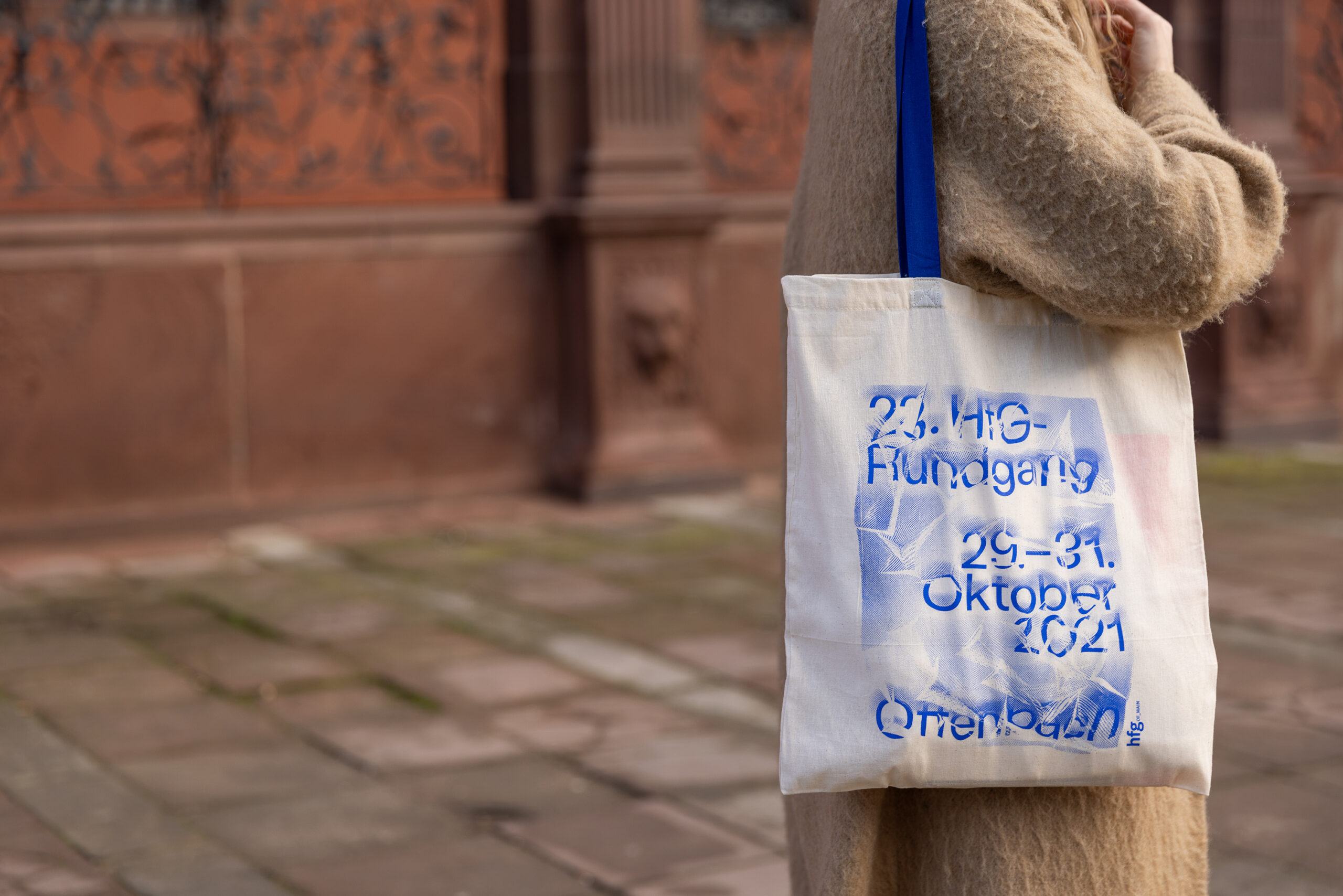
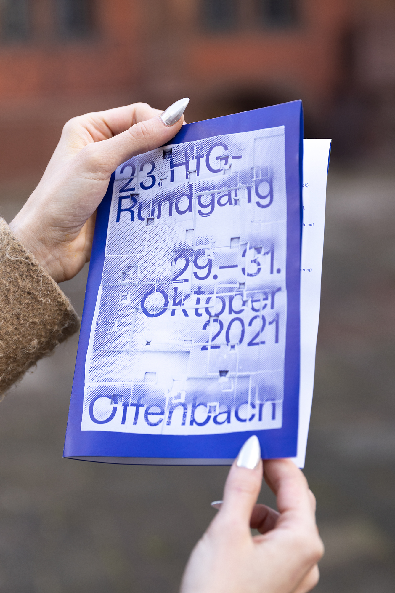
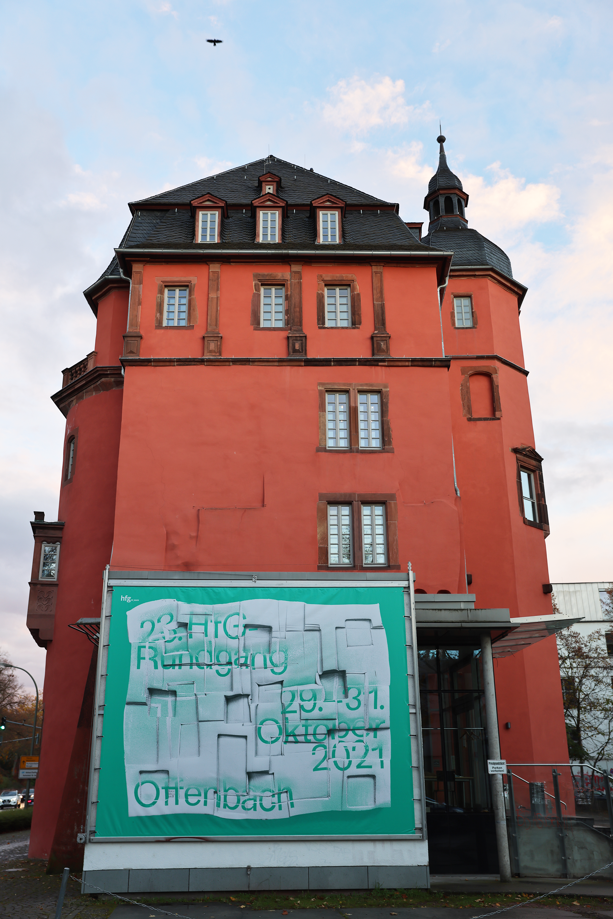
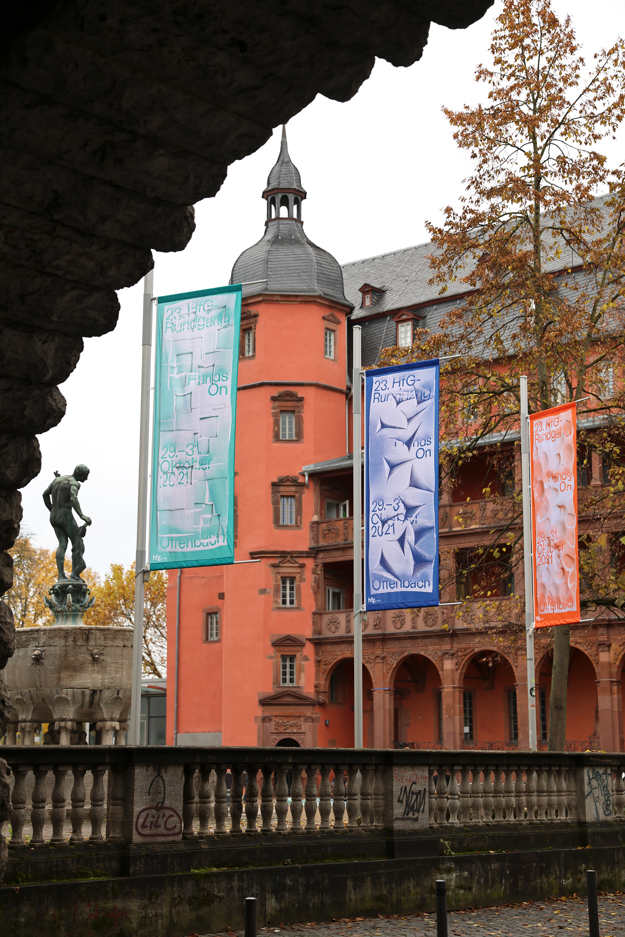
"Hands On!“ is the claim of the visual identity for the 23. Rundgang at HfG Offenbach, the university's annual group show. This project was a collaboration with graphic designer Laura Hilbert.
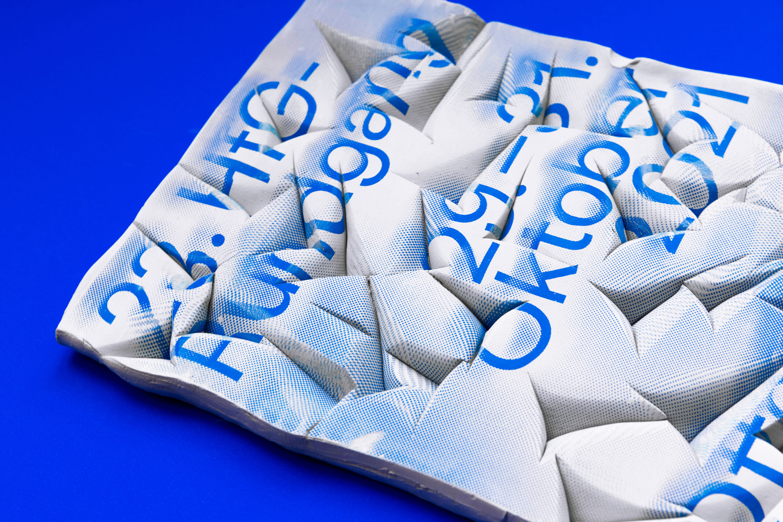
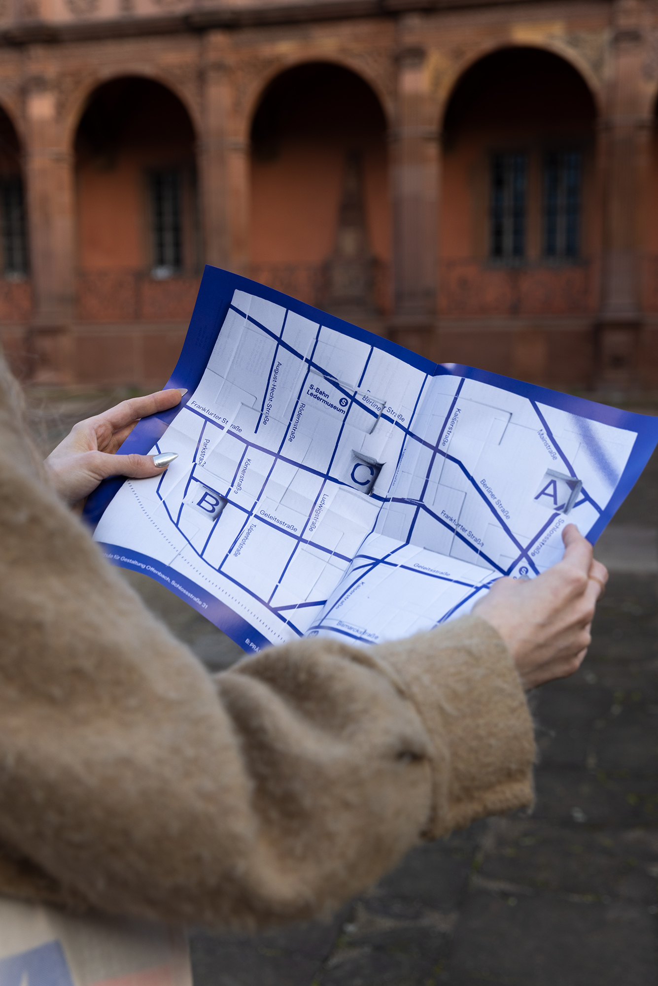
Due to the pandemic exhibitions had to be canceled or moved into the digital space. To counteract the lack of haptics Sarah and Laura came up with the idea of producing the identity in an analog way: Using their own hands.
Every part of the visual identity is made out of screen-printed clay that was deformed while it hadn't dried yet, photographed, and edited digitally afterward.
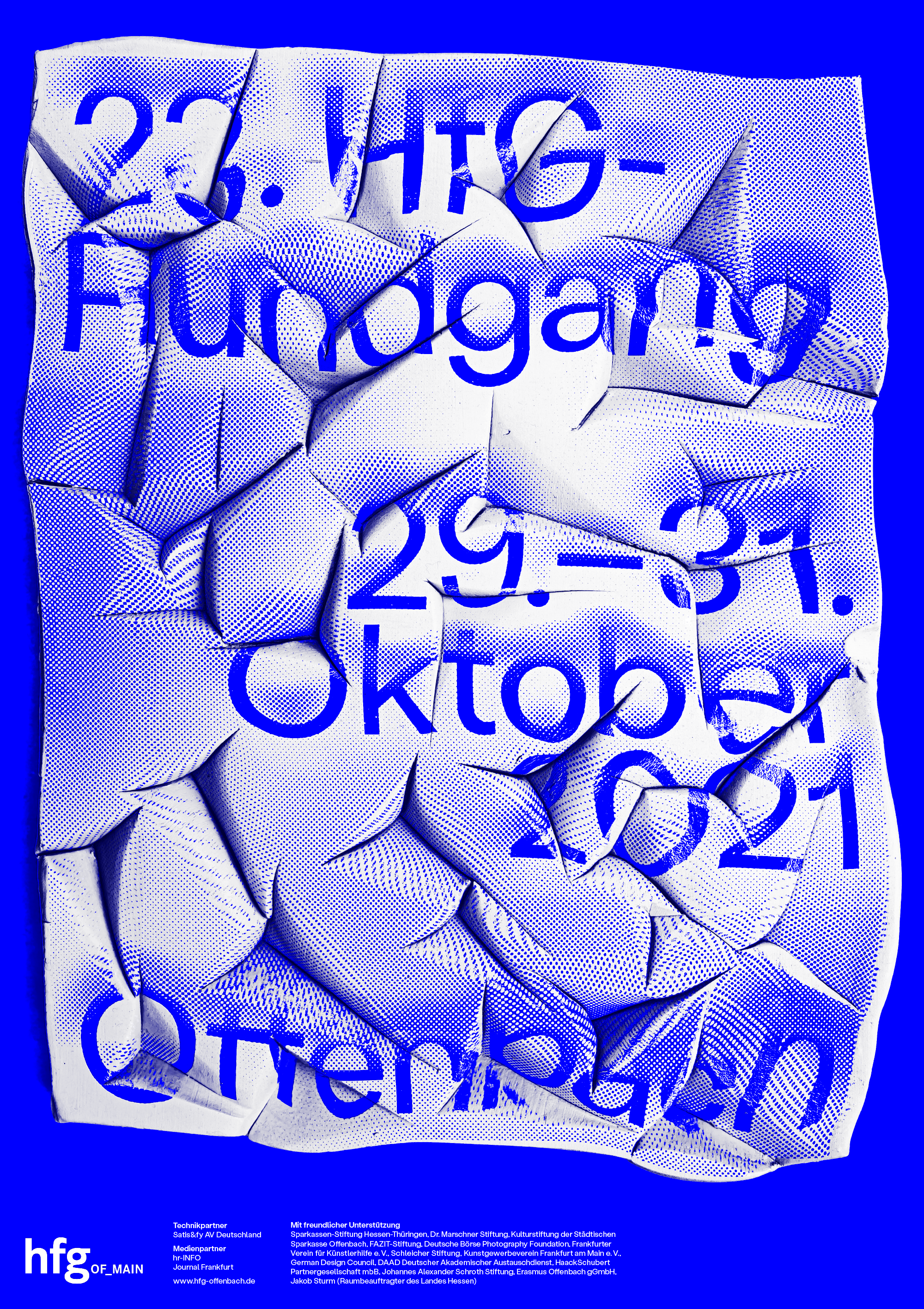
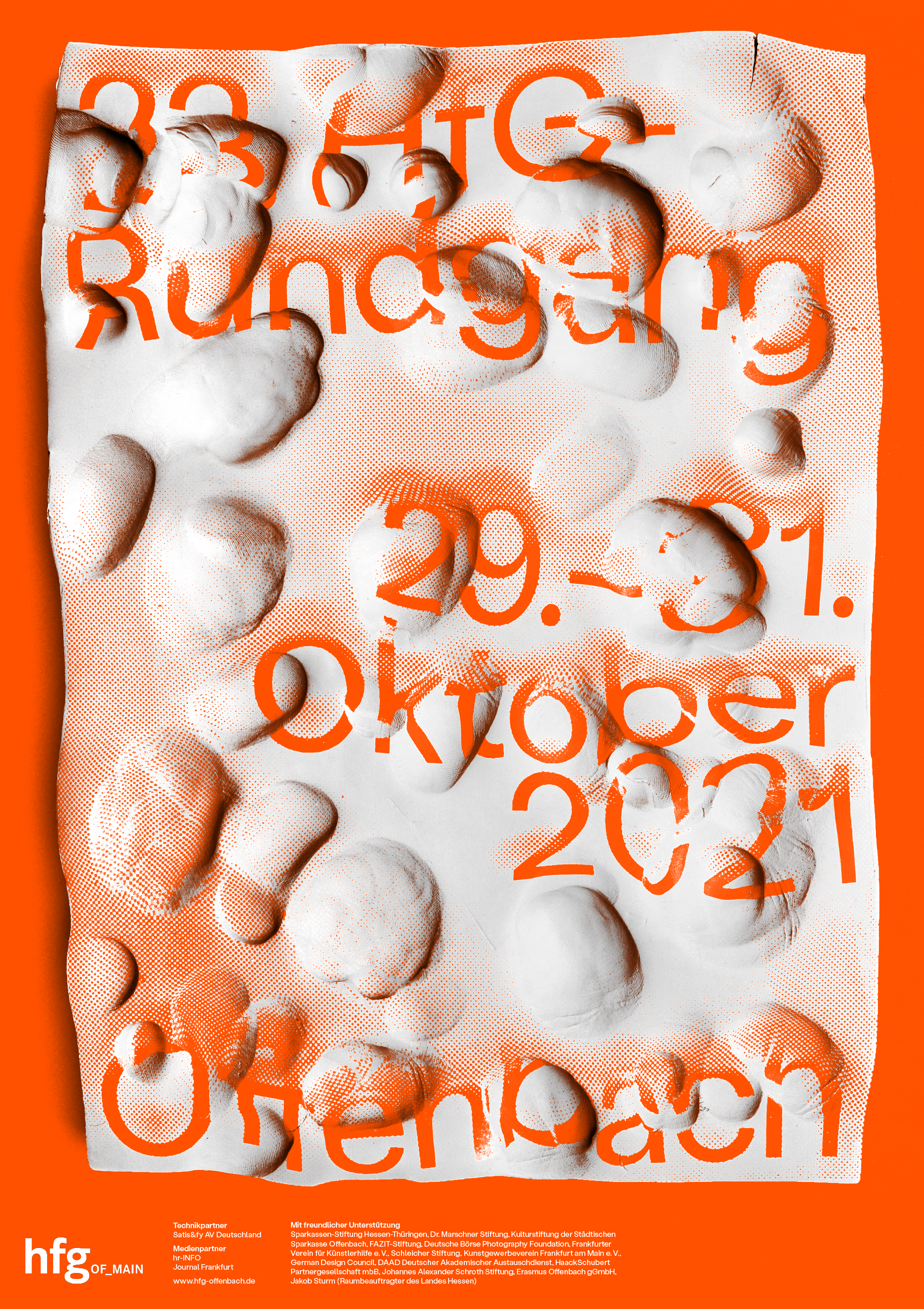
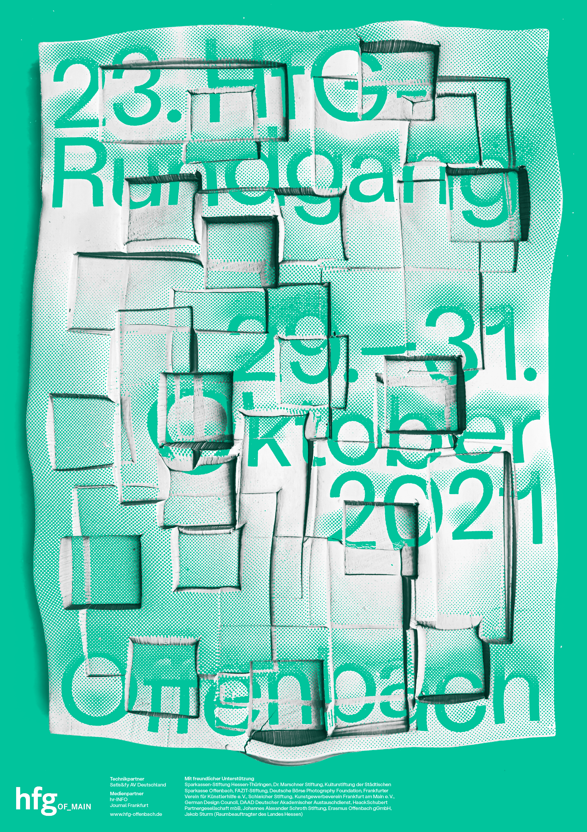
This analog process was very time-consuming but strengthened the decision-making and led to unexpected results that wouldn't have been possible digitally.
Project "Hands On!" picked up awards from the Type Directors Club (including the Judges’ Choice & 1st Place Student Monetary Award 2022), the ADC Talent Award 2022, 100 Beste Plakate 21 and secured Laura and Sarah a speaker's slot at the digital-forward Inscript Experimental Type Festival.
Typeface: Stabil Grotesk by KOMETA
"Hands On!" was featured in Page Mag | FAZ | It's Nice That | BranD Magazine