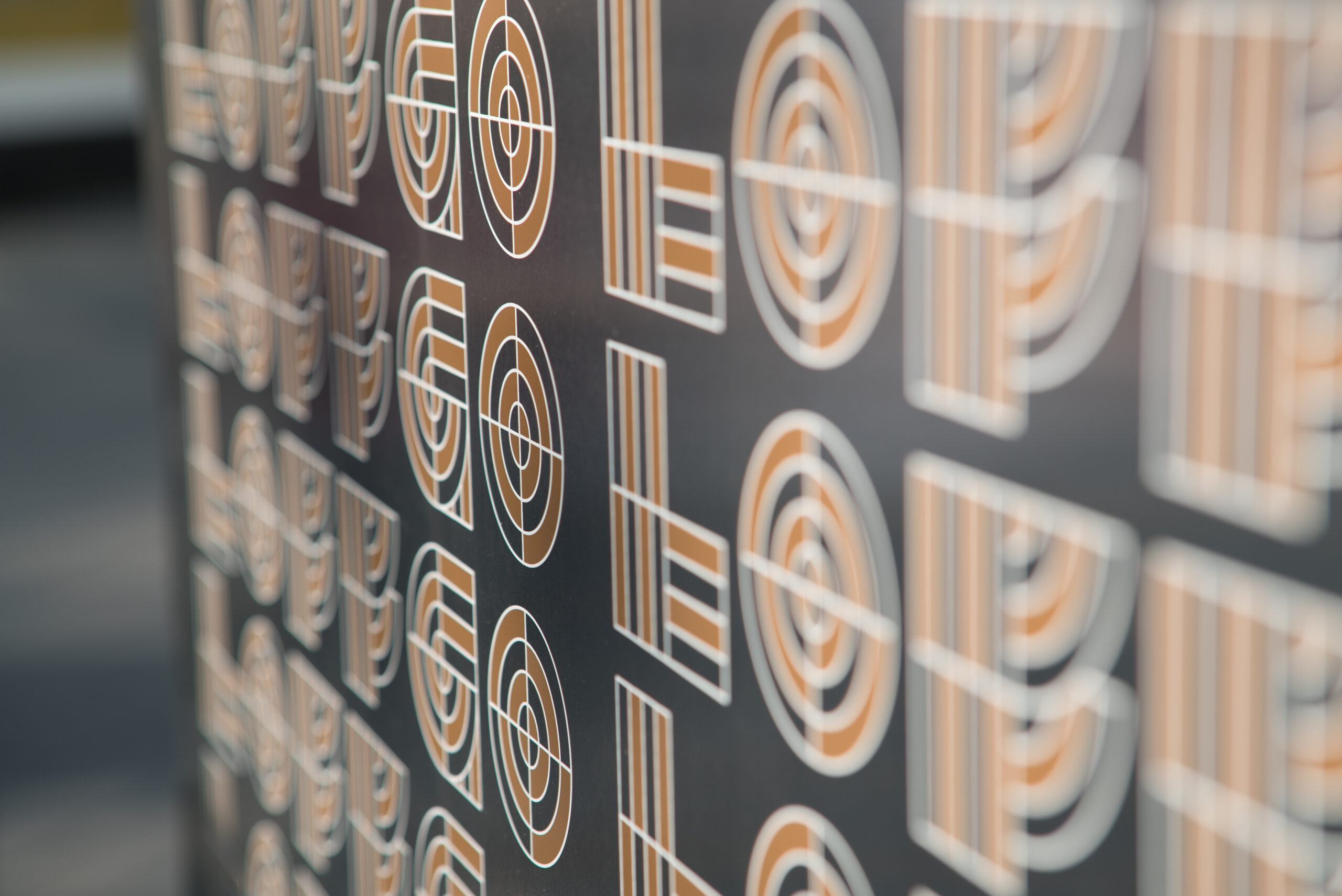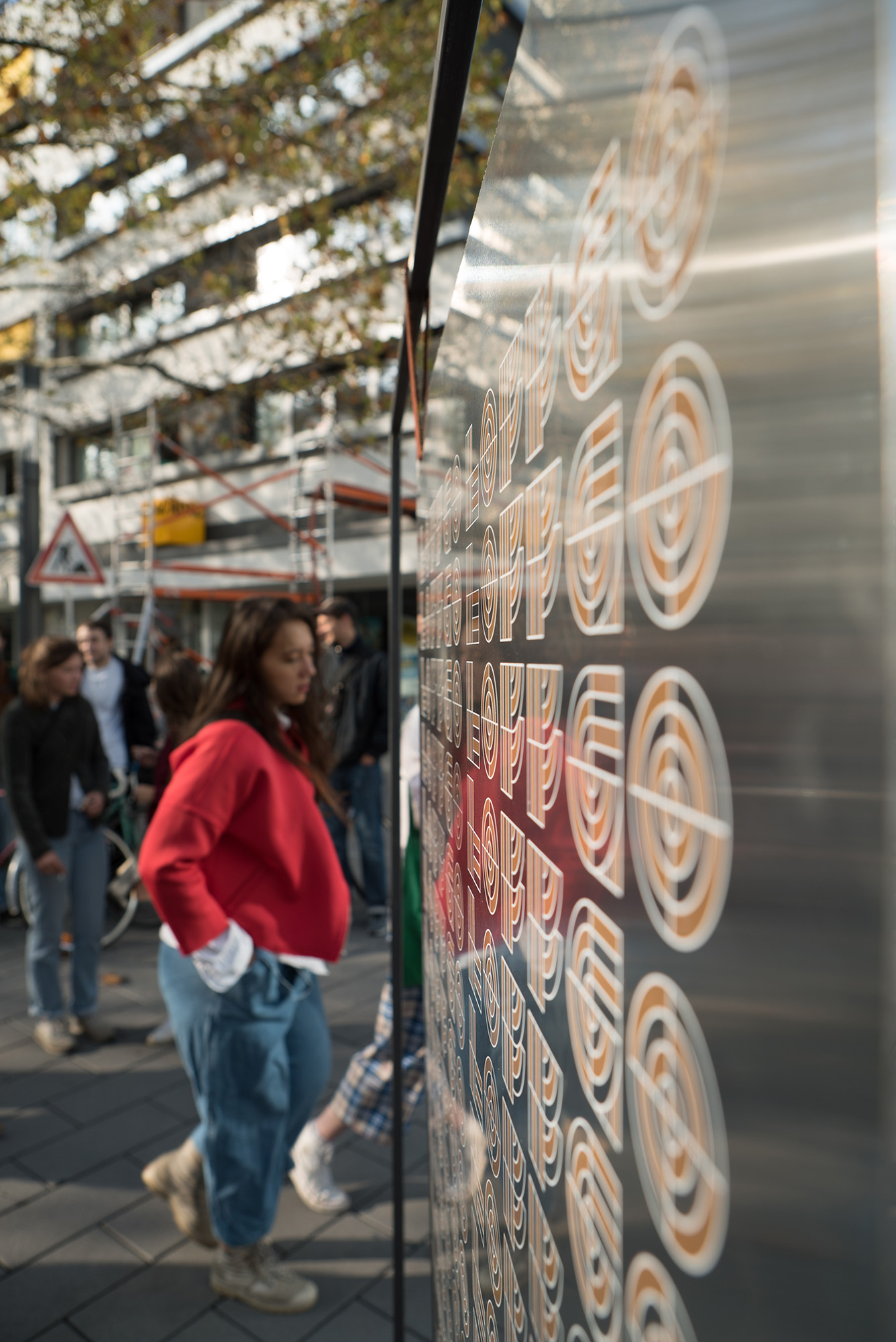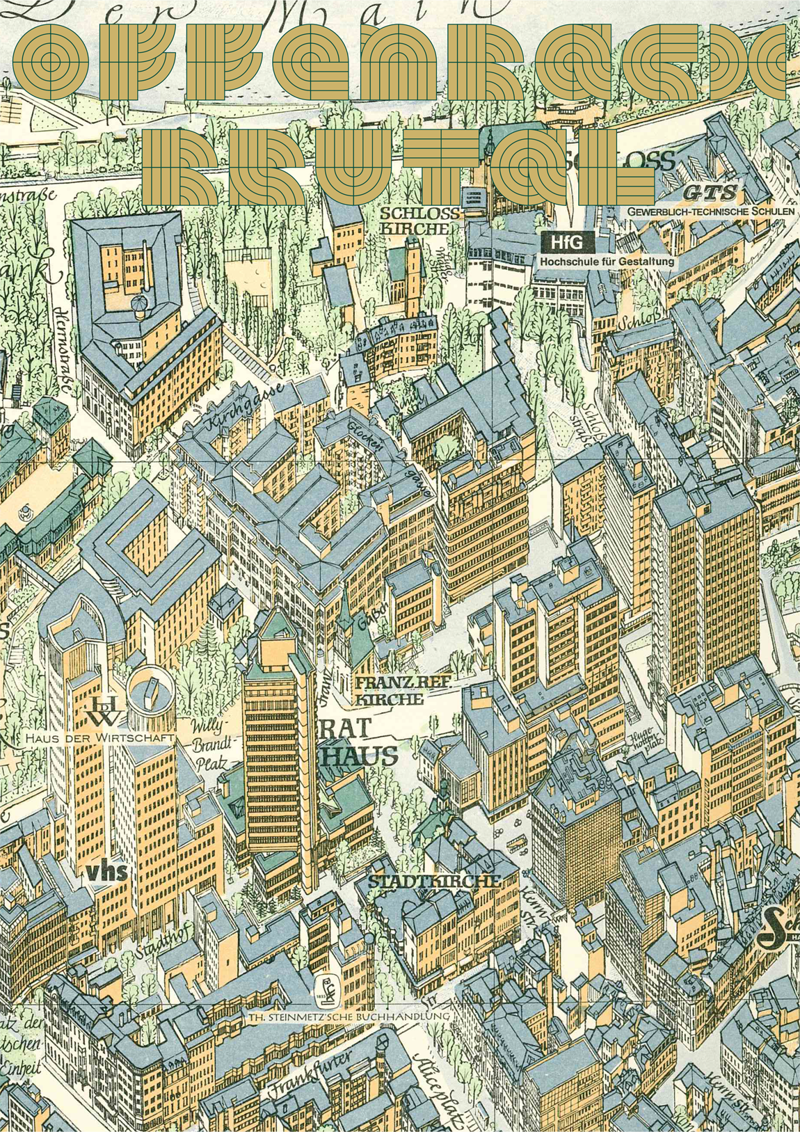


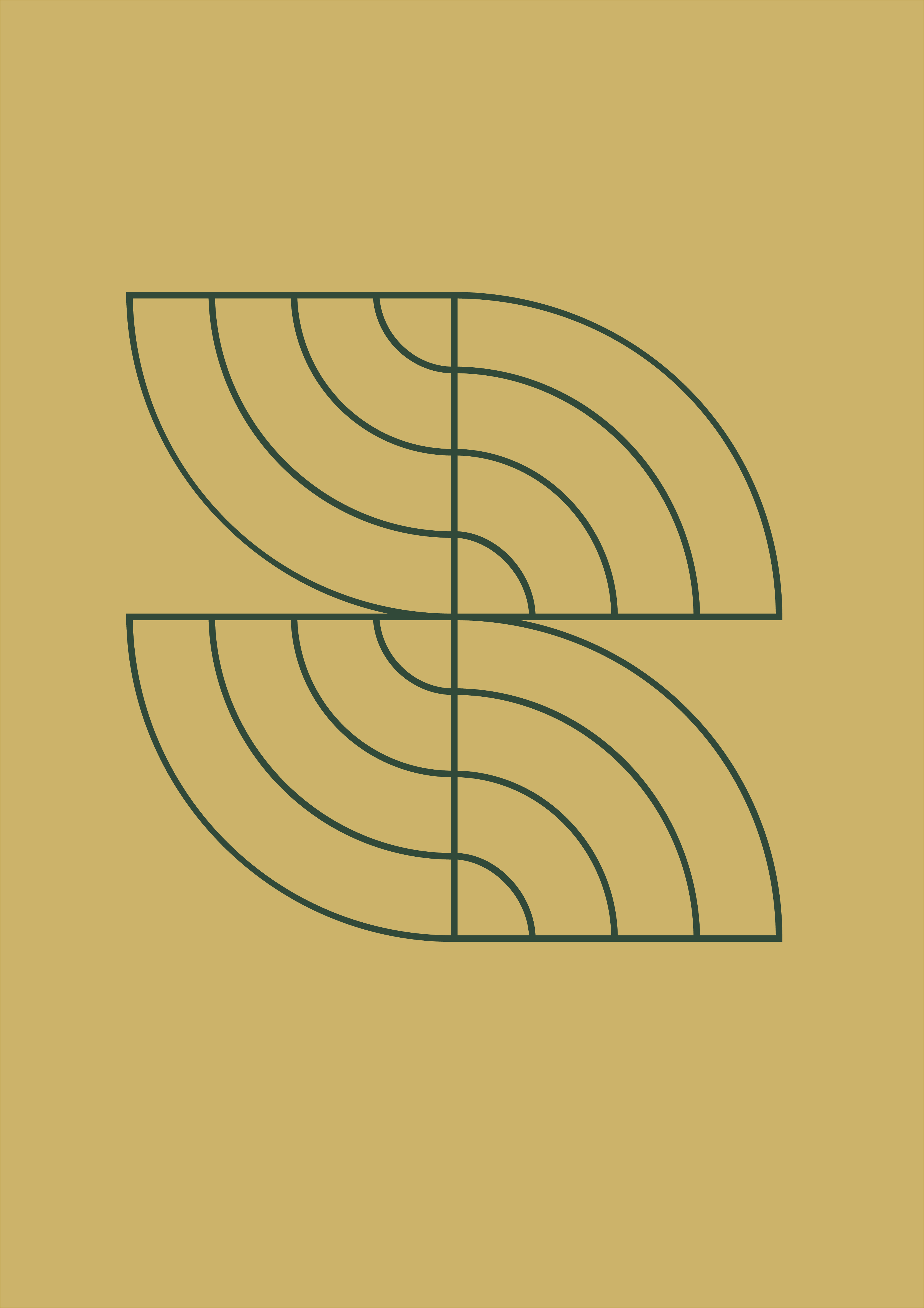
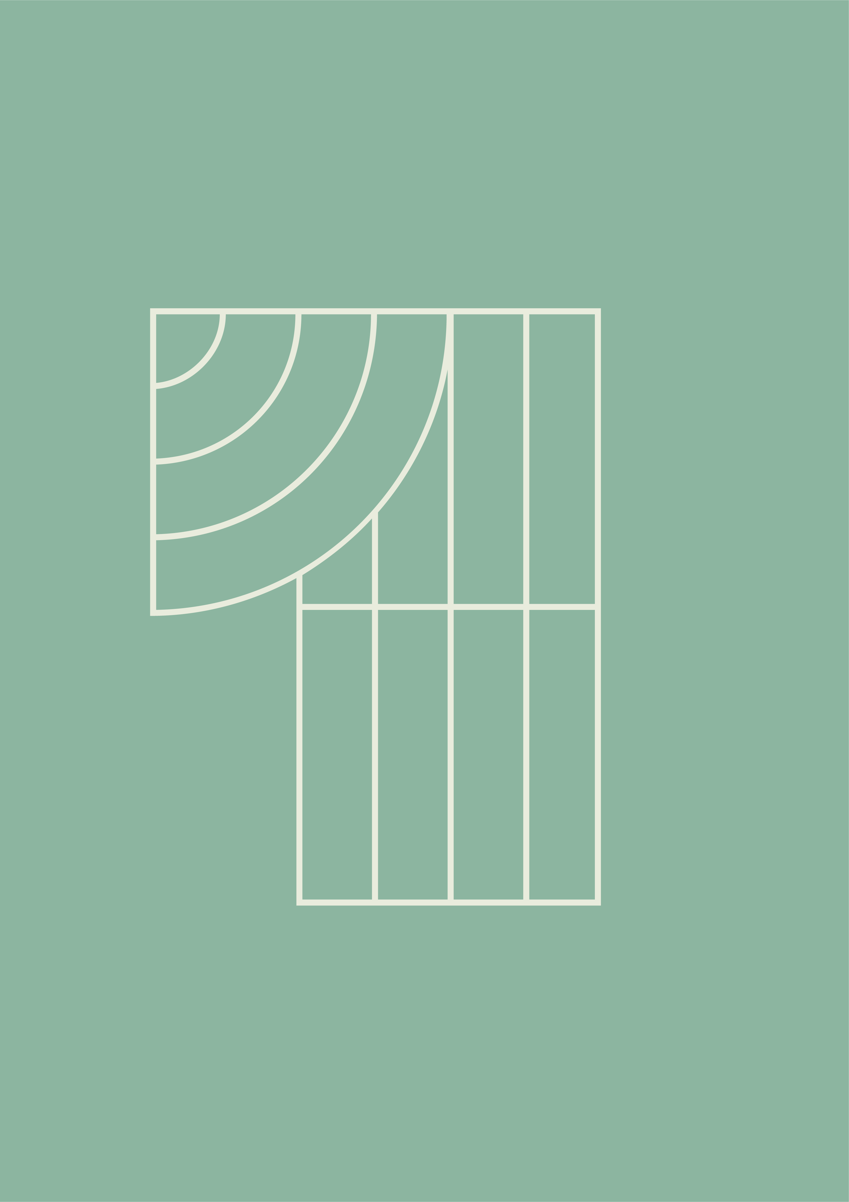
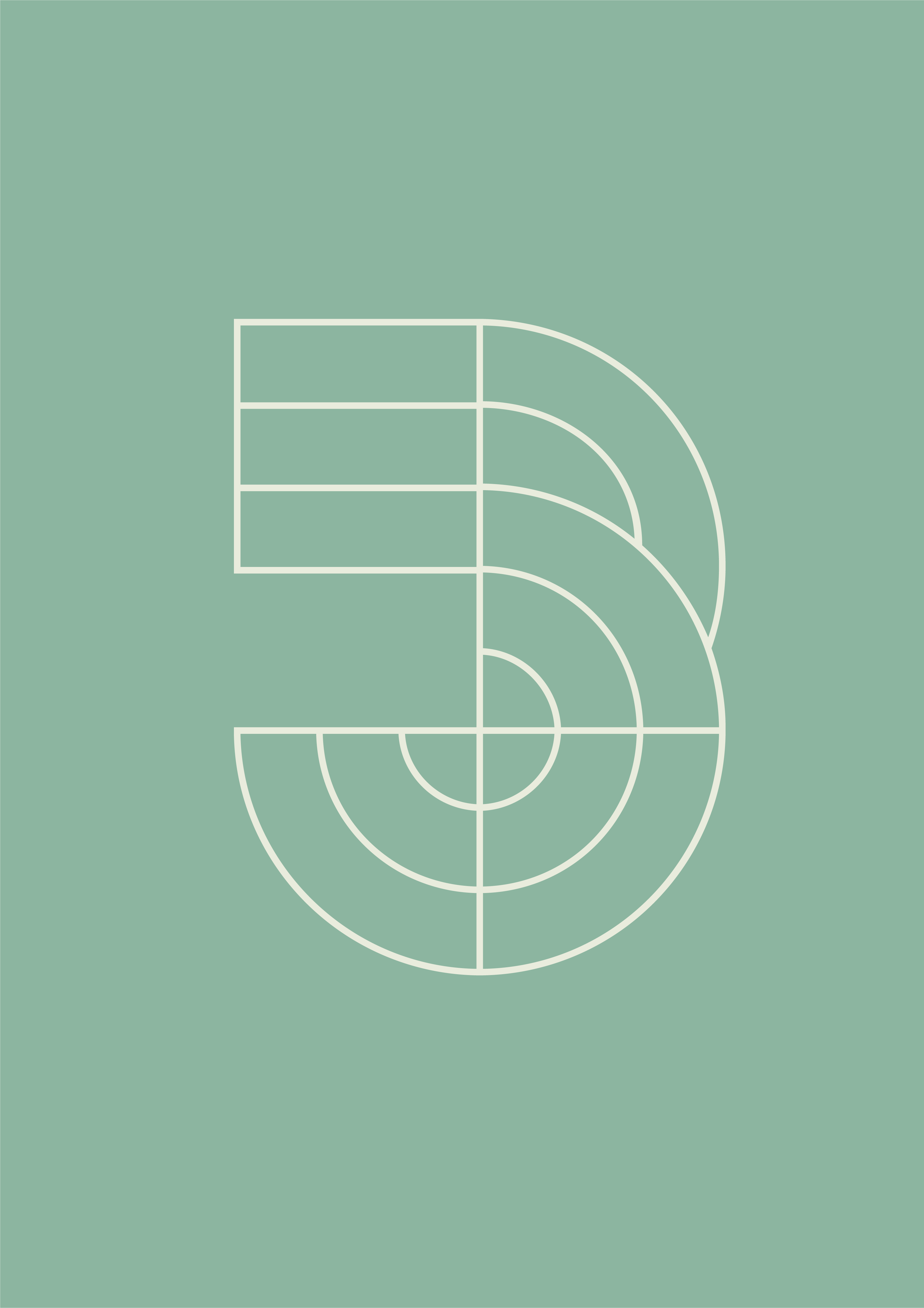
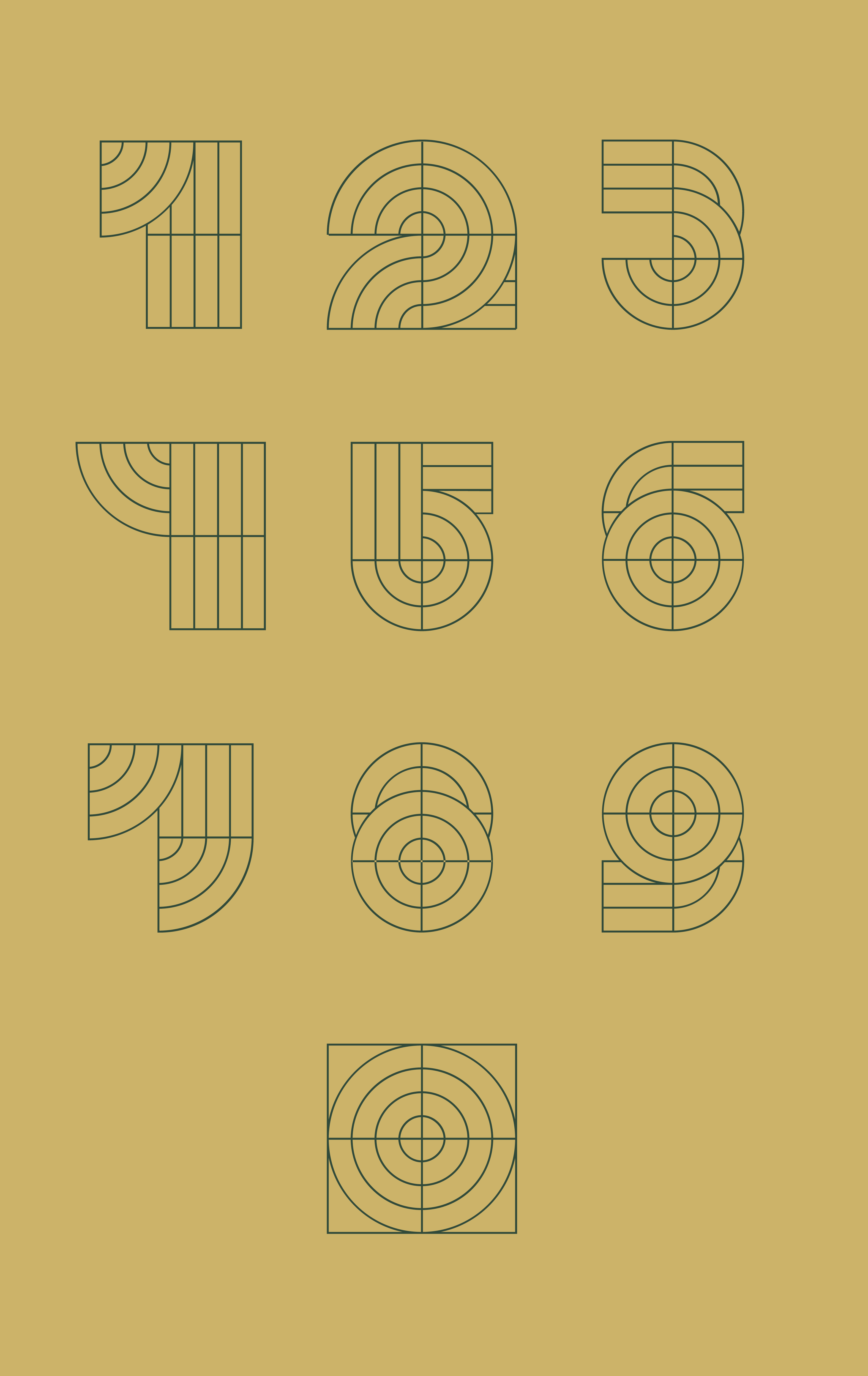
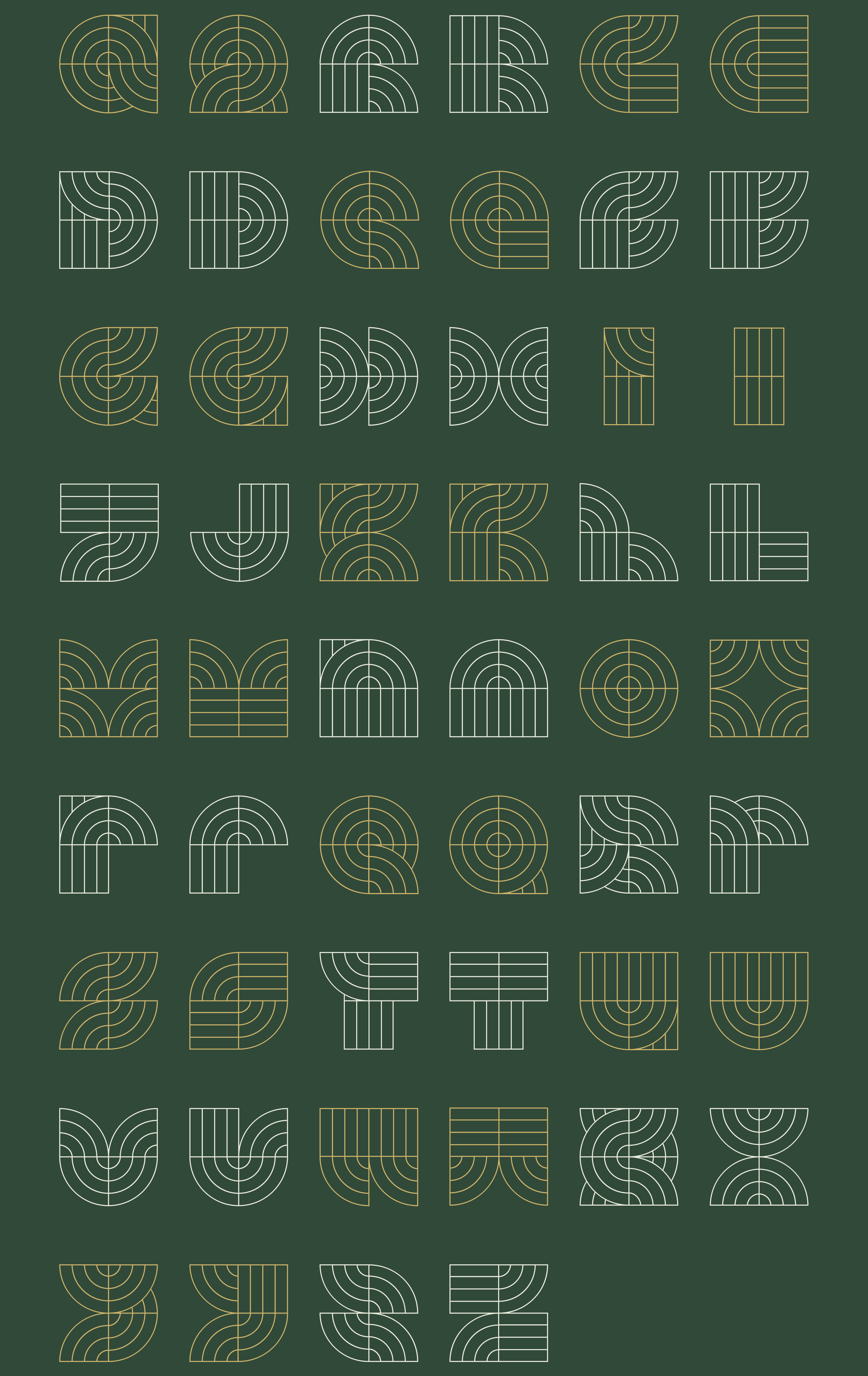
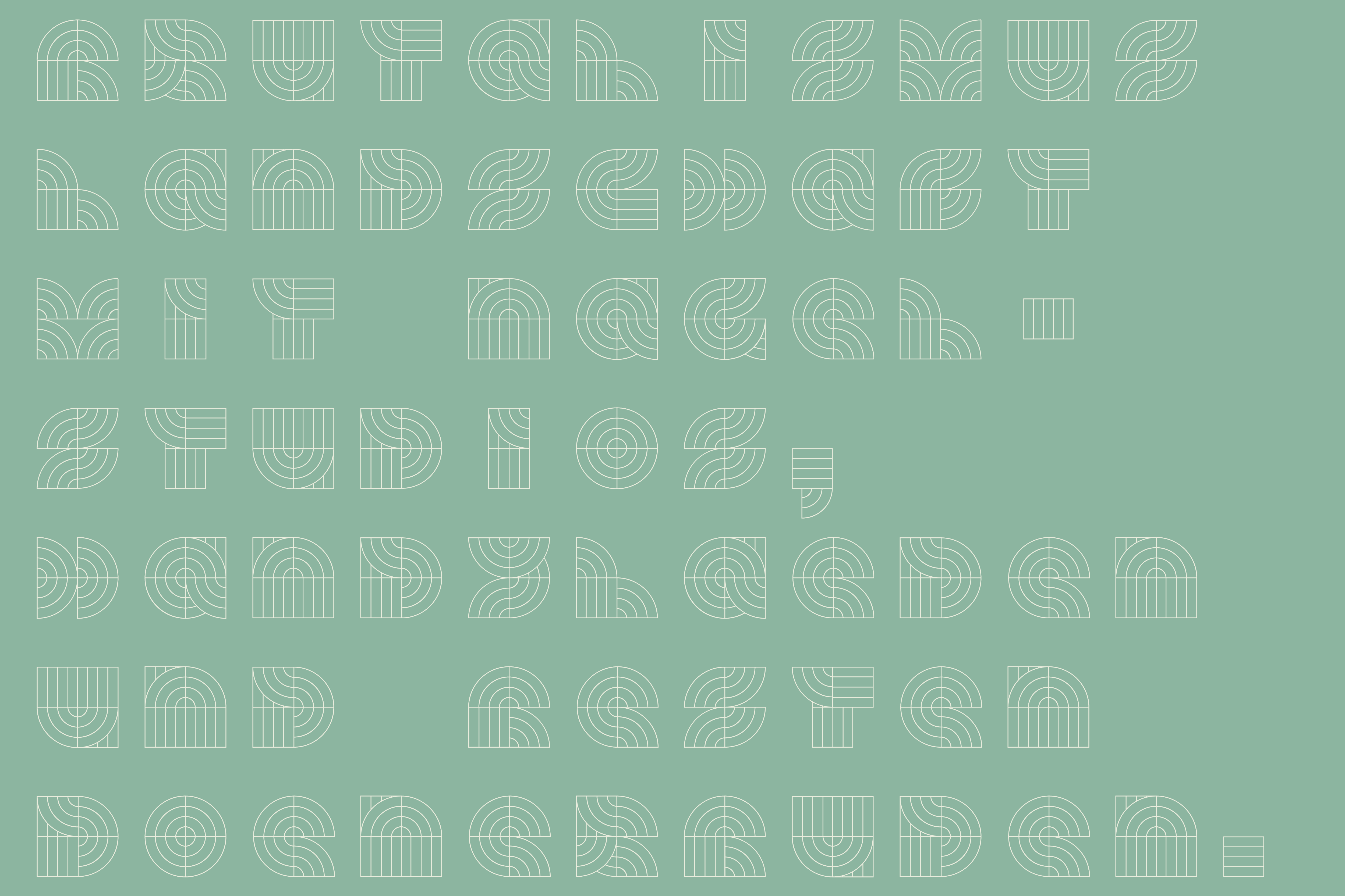
OFFENBACH BRUTAL is a headliner typeface inspired by the urban and architectural look of the city of Offenbach am Main, Germany.
The name "Brutal" refers to Brutalism, which is the architectural style that is most dominating in the center of the city. After certain districts have been destroyed during World War II, these spaces have been filled with social and industrial architecture. Therefore, nowadays a mixture of old and new buildings characterizes the lively and diverse appearance of this city.
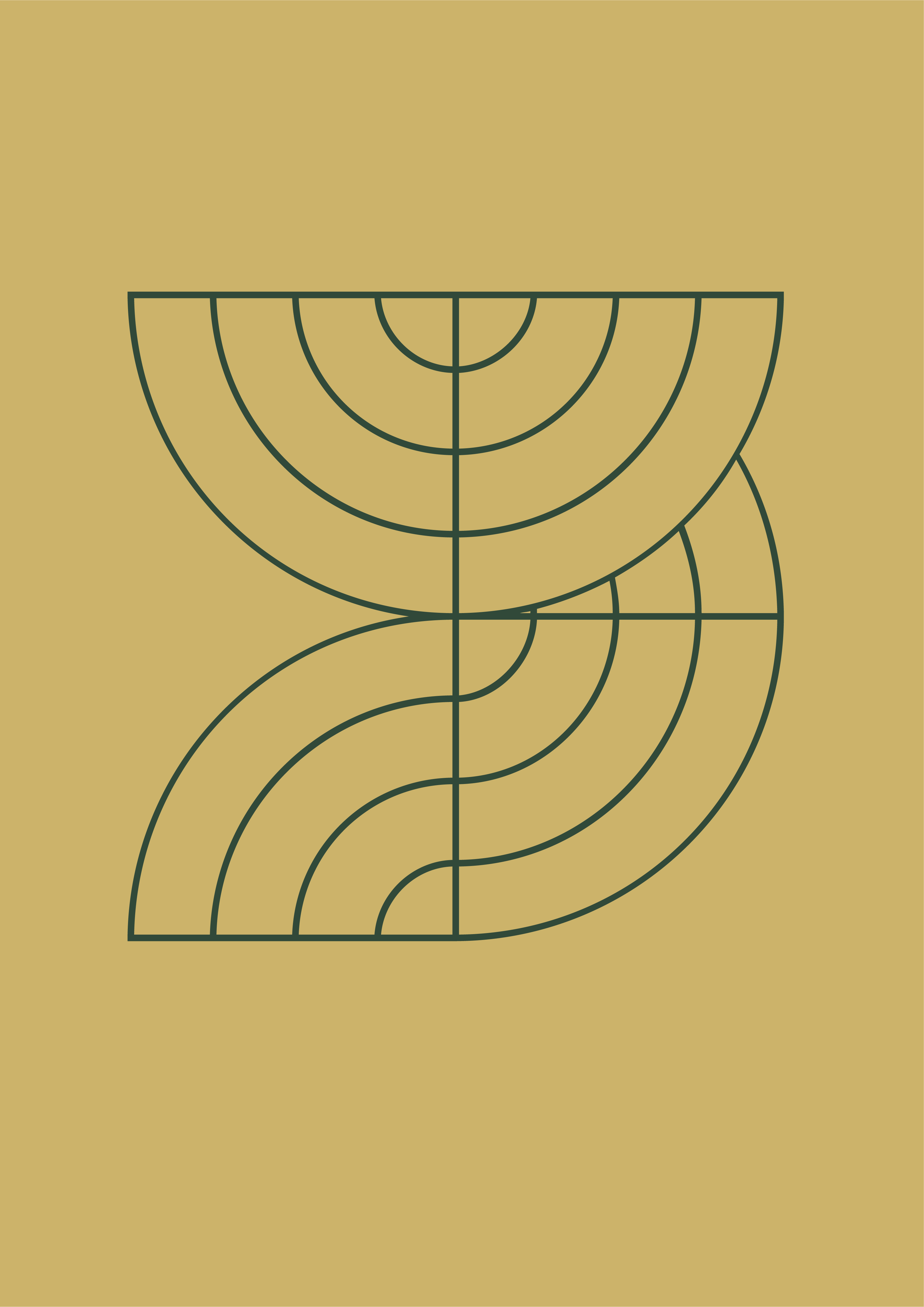
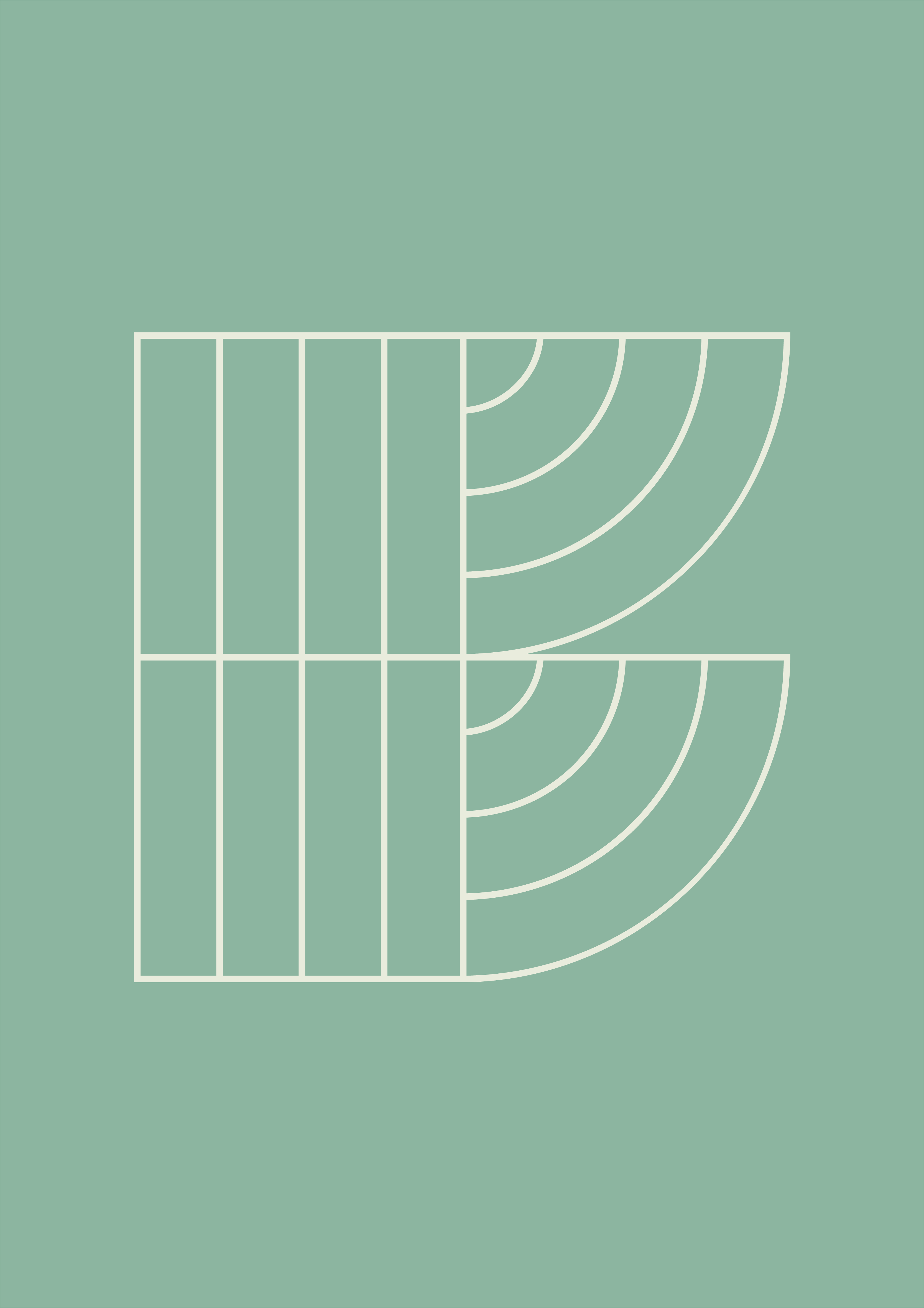
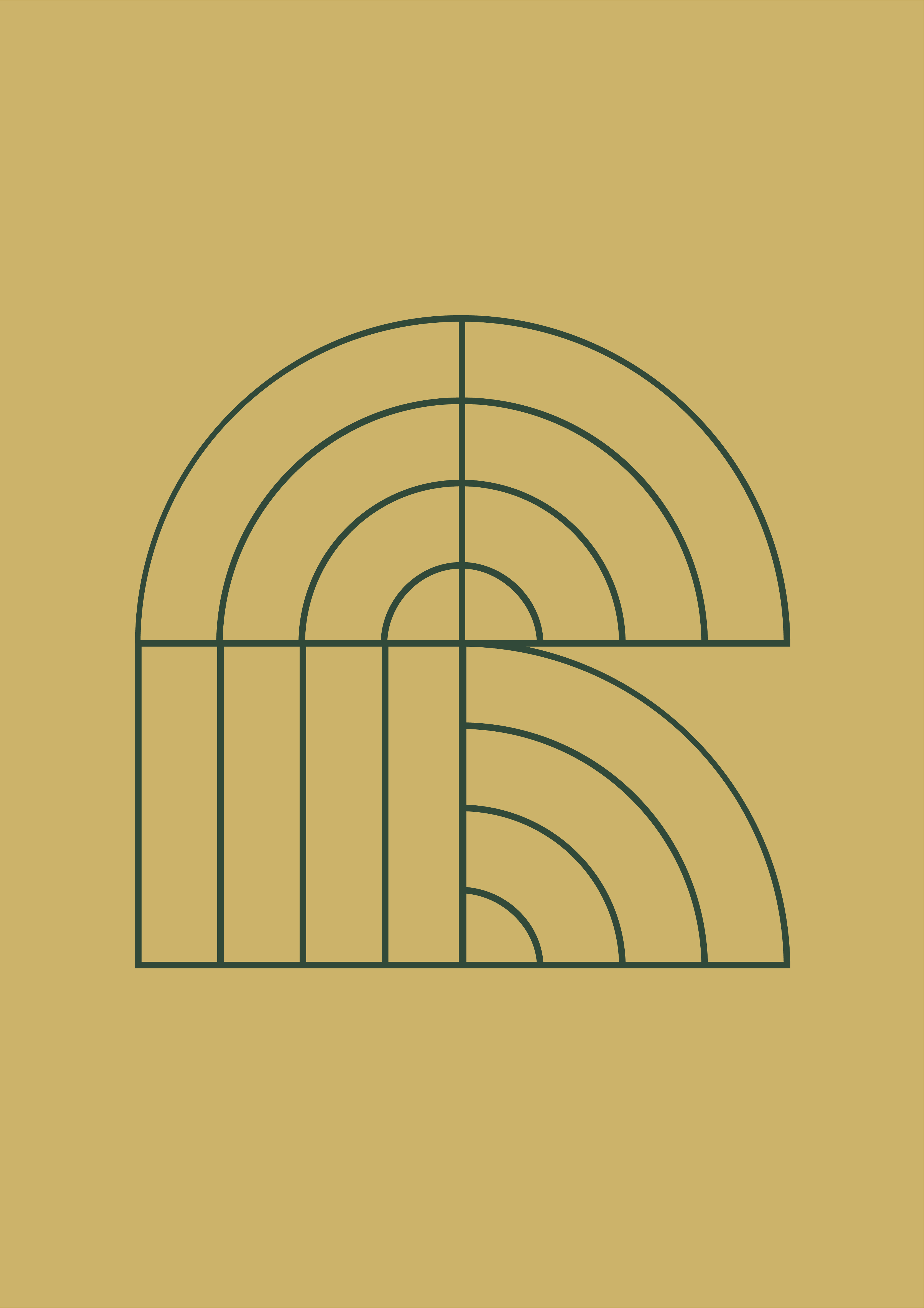
The individual letters of OFFENBACH BRUTAL are composed of both strict and organic components to resonate with the mixed appearance of old and new. Together with Type Designer Dalton Bruyns, the Regular Weight has been finalized and will be sold via Modern Type soon.

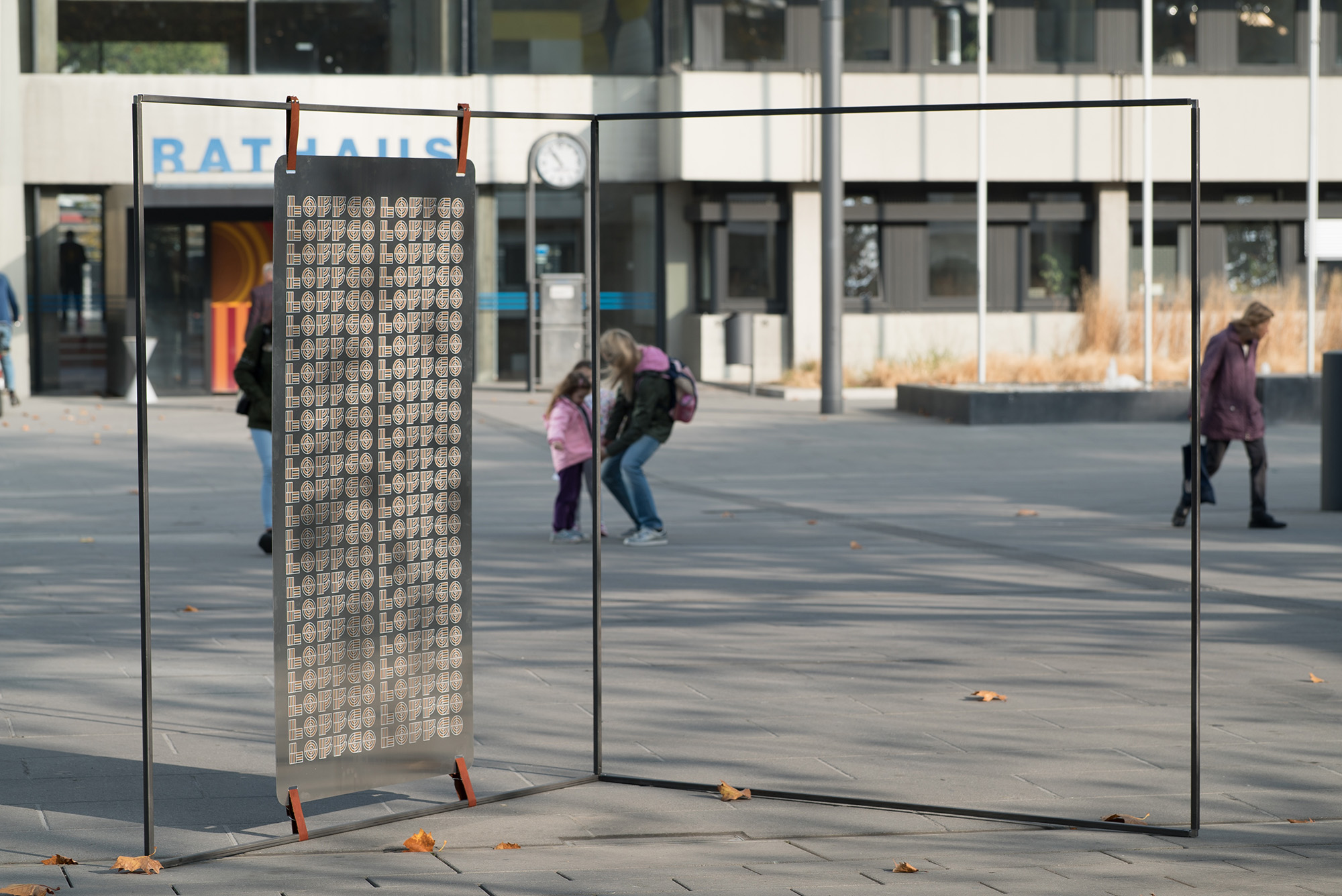
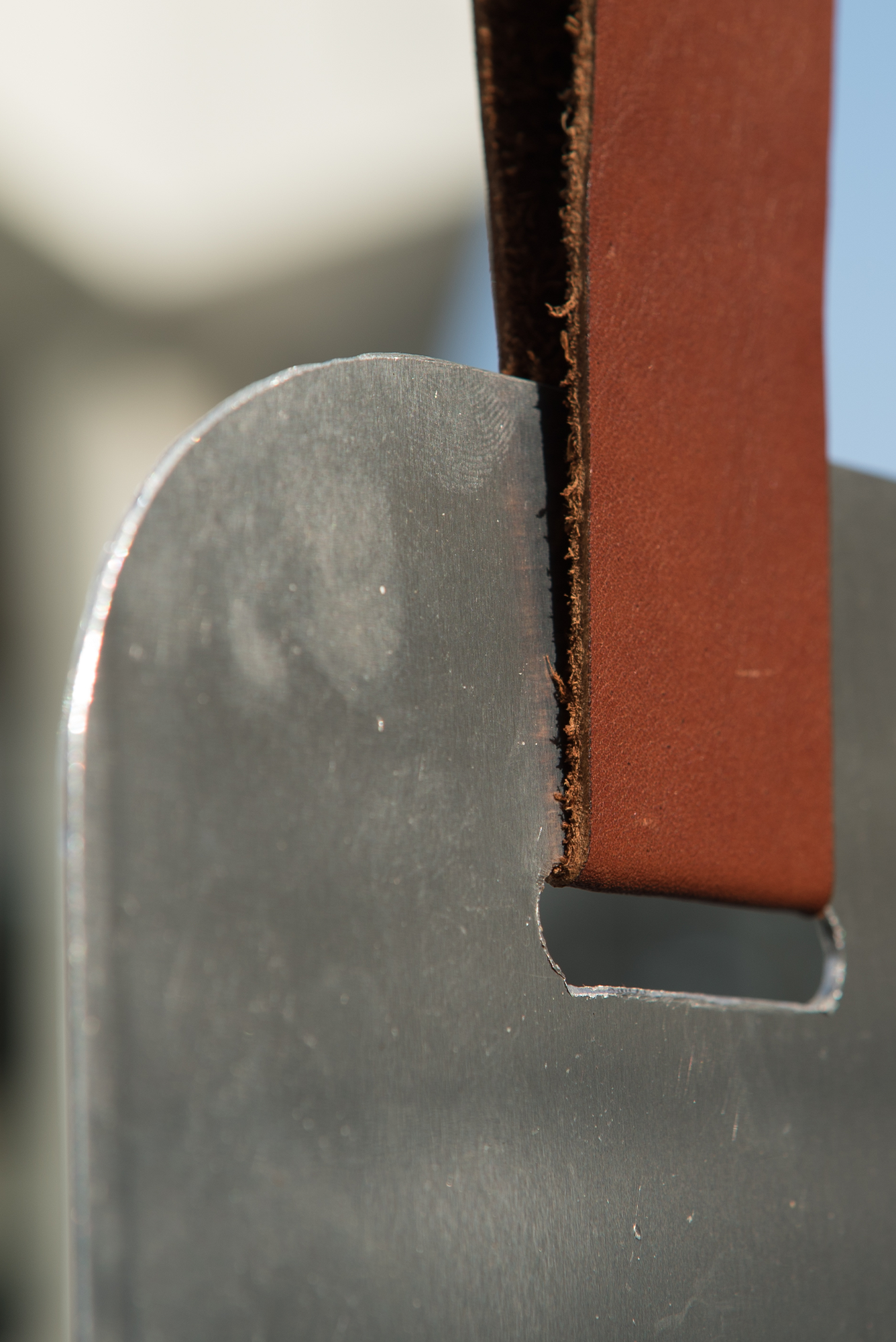
During the production of an urban exhibition system, steel and leather were used & silk-screen printing was applied to refer to the heyday of Offenbach's industrial history.
This plug-in system offers the possibility to display artworks and works of art on any flat surface, both indoors and outdoors. It can be installed and dismantled quickly and freely extended with additional square tubes and angles as needed. The stand was presented at the Offenbach town hall square to draw attention to Offenbach Brutal and Project LOFFGO.